


Dream Team
Art director Adam Wilson
Manager Mike Abbott
Designer Nur Asyrof M
Compa.ai is an AI-driven compensation intelligence platform that helps enterprise companies make data-informed pay decisions using real-time market data from over 9 million observations across 50+ countries. CompaBusiness Wire The platform replaces traditional annual compensation surveys and z with automated market data drawn from systems of record, allowing companies to compare salaries, equity, and incentives against peers while using AI agents to accelerate analysis and surface insights.
As part of Polyform Studio, I had a responsibility to improve website design for Compa to be more align with new brand, and looks more premium. We collab on visual art redirection, visual creation and animation graphic to support every Compa's features.
We did a tons of early research docs.

We mapped out how the industry looks like in Competitive analysis, so we can have a bigger picture on how companies around Compa act, move and transform with SWOT analysis.

We make sure that this is not just simply redo the whole thing. We carefully analyze what to keep and what to updates, by breakdown the all sections and component to map out detailed analysis, gather references for each section, see what works, fits and possibly improve new brand directions, and finally propose the new sitemap and structure for new informations and features Compa need to tell to the world.

We also breakdown all site structure into sections, iterate and built to finally proposed a brand new Information Architecture for new Compa website.
Then, we redefined
how Compa visuals direction.
When we first sat down with the Compa team, one thing was clear: they needed a look that matched the caliber of clients they serve. So, we redesigned the logo, visual look and brand guideline as final product to represent their new goals.

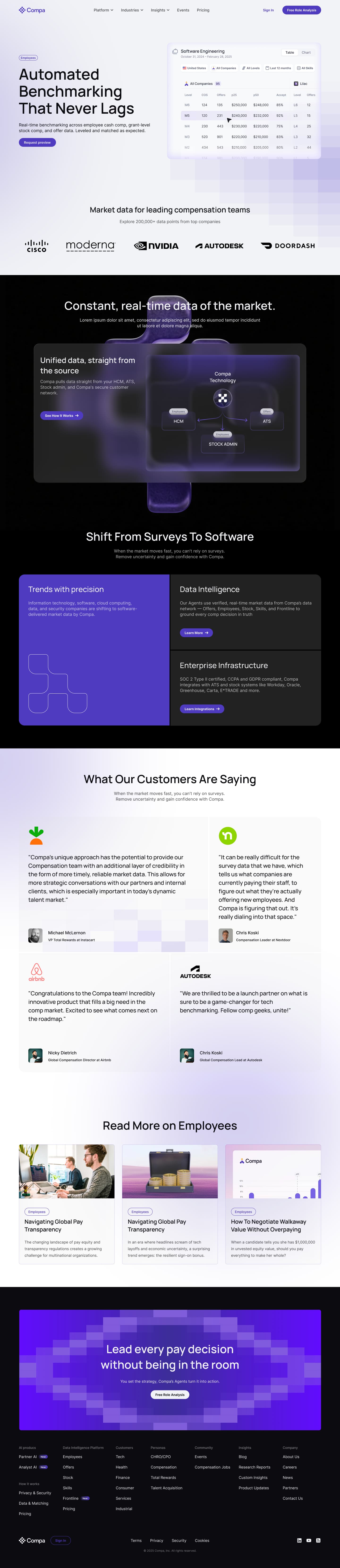
New website journey.
After a tons of researches and wireframe iterations, we started design and implement new look and copy to match the brand direction.

Section by section, I carefully design for both light-dark and dekstop-mobile so its easier to be a discussion material before we decided which one works best visually, combine light and dark in certain pages, etc.
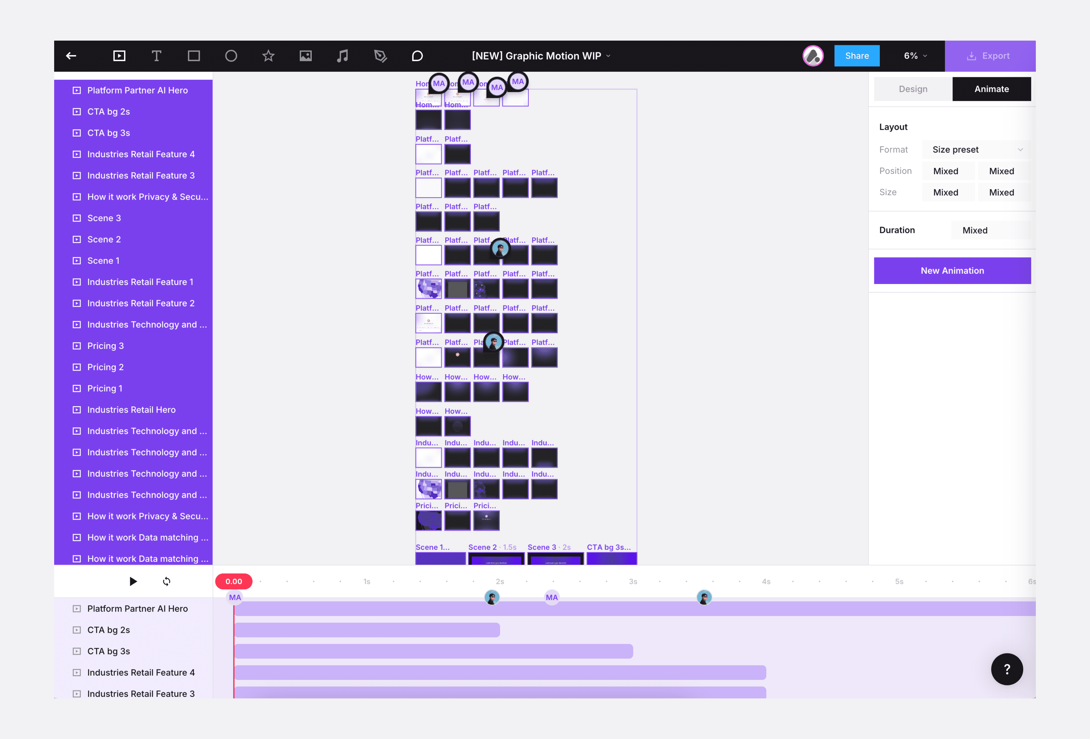
Compa in motion
To boost website experience, I also redesign motion graphic assets for each features. Over 55+ motions done in Jitter to explain all feature details in the website.
See it live!


Thanks for scrolling
© 2026 Asyrof